Wednesday 1 April 2015
colour development
from beginning to making-- parts of the colour development process for my 'weka rangi' jewellery collection
find me here, AND out there!
These 2 interviews are a few months old now (wow, how time flies!)- but seeing as I didn't mention them here at the time, I just thought: why not now?! Just incase you fancy taking a peek at some of my recent work elsewhere...
bags of love t-shirt winner interview
My projects featured on Chelsea blog
...Happy browsing to you if you do!
bags of love t-shirt winner interview
My projects featured on Chelsea blog
...Happy browsing to you if you do!
(wearing my winning floral t-shirt design, printed by Bags of Love)
Tuesday 23 December 2014
jewellery outcomes!
Here is my work at our college colour exhibition! I made jewellery in the end, and I loved it- hopefully they'll be more where this came from! It's been a busy term, and I was blogging for my sketch innovation TOP module (you can see a couple of the books I made here), so this blog hasn't been updated so much, but ah well- you can only spin so many plates at once, hey?!
I hope you like my jewellery though! And Merry Christmas to you if you're reading this :)
Thursday 23 October 2014
extracting colour
After the colour workshop, I've been going through my research photos and pulling out the colours to make some more palette arrangements linking to my project.
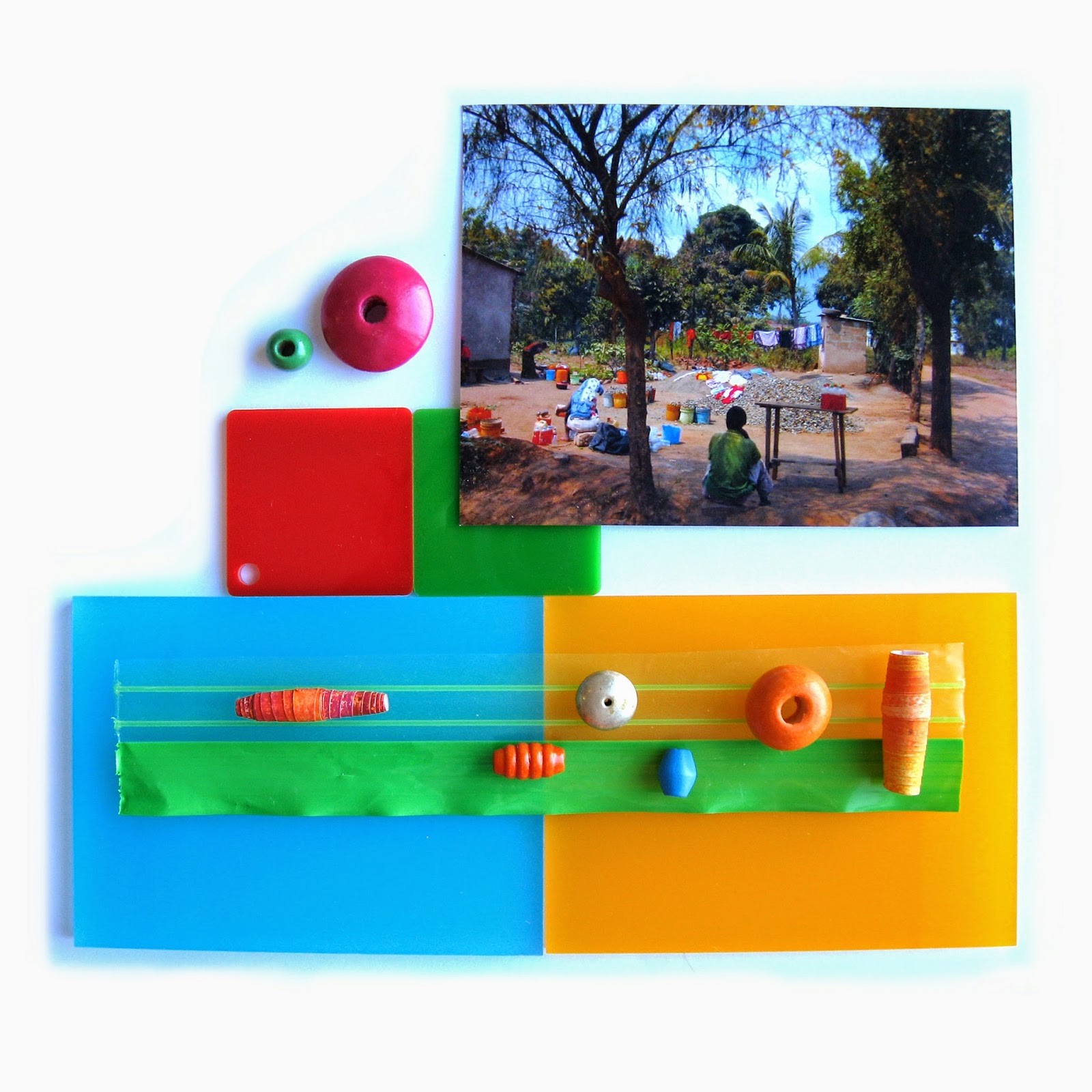
Seeing as the Tanzanian landscape had quite a busy feel, with many different materials and surfaces being recycled and reclaimed, and being reused in a multitude of ways, I like the idea of using found objects in my colour work...it's like the 'fabric' of the environment there was very responsive, in flux, and cultivated collectively by all the people living there...so I want my work to have a similar feel...a bit of a jumble...collections and arrangements of colour that evoke the lively, quirkiness of the place....a sense of rawness and imperfect human touch....a realness and an immediacy....
Seeing as the Tanzanian landscape had quite a busy feel, with many different materials and surfaces being recycled and reclaimed, and being reused in a multitude of ways, I like the idea of using found objects in my colour work...it's like the 'fabric' of the environment there was very responsive, in flux, and cultivated collectively by all the people living there...so I want my work to have a similar feel...a bit of a jumble...collections and arrangements of colour that evoke the lively, quirkiness of the place....a sense of rawness and imperfect human touch....a realness and an immediacy....
colour play
Last week we had a fun workshop with Phillipa Wagner, all about exploring colour. I found her theory on 'natural palettes' (the idea that we all have colours we are comfortable working with, and naturally gravitate towards) really interesting- and quite a useful thing to consciously understand, as a designer! Plus, it was a great way to get excited about the idea of arranging colours, considering our current project brief.
We were instructed to grab 6-8 objects the bring along to the workshop, and then worked in groups of 3 to arrange our collective chosen objects into a 'colour matrix'. It's useful to see colour spread in this way, in order to recognise the balance of the colour you're working with. Funnily enough, in our group, the colour range was perfectly proportioned- Heather had bought all neutral, natural coloured objects, Lisa's were all light and white coloured, and my objects were all bright colours! So our matrix covered all the bases:
Then we composed a set of different colour palettes using our collection of colours from the matrix. I loved doing this as a group - we took it in turns to each add a colour to the palette, discussing how it would change the overall effect in combination with the other colours that were being added. It was fascinating to share our different approaches to colour as a group!
Here were our palettes. First up we made a mini collection of the objects we wanted to dicate the colours for each palette...then, we searched for fabric swatches to translate the palette into a textile story:
set of objects, then swatches for our second palette:
3rd collection/palette:
Our final group palette. For this one, Philippa challenged us to work with a gradiating move of colour across the palette, as all our previous combinations had a good spread of lights/brights/darks. So here, we went for a neutral flow:
This has definitely made me think about my own attitude to colour...and how my own attraction to brights generally seems to channel it's way into my design work, somehow or other!
Finally we made up our natural palettes derived from the objects/colours we'd intuitively selected for the workshops as individuals. Here's mine:
And actually, these colours are similar/connected to my project colours right now- the orange, plummy pinks/raspberry, and the bright green. What a co-incidence....!
Now it'll be fun to carry this experimental palette creating approach through to my work. I also like the idea of using objects to original represent/derive colour from. This could be carried further through the design process, and the objects could perhaps feature in the designs somehow themselves? Let's see- it's all to play around with!
Thursday 9 October 2014
orange in the libary
Seems like I'm tuned in to all things orange at the moment. It started out with being drawn to the arrangement of orange books on the shelves looking at the colour of the spines while I was in the library.
I then started taking some quick snaps for ideas to help develop thinking around proportion and groupings, and just to generally feed into inspiration for my project. Colour is everywhere! It's time to get excited!
I then started taking some quick snaps for ideas to help develop thinking around proportion and groupings, and just to generally feed into inspiration for my project. Colour is everywhere! It's time to get excited!
block orange
orange/red/blue- colours found in my research. Interesting seeing them like colour chips represented in strips by these books here. (for project development- think about how I can use found objects to help capture/define/give a sense of colours I want to use...)
now: within the pages. The following images are from Emil Nolde's 'Radiance and colour' book I was flicking through. I love the vibrancy of the orange and the blue. The strength of the blue here reminds me of the 'blue room' at the National Gallery's 'Making Colour' exhibition I went to last month. Striking and beautiful.
Imagery taken from magazine ads that I was then looking at. Blues, oranges, browns and greens.
It's interesting just looking at how colour works in everyday life, the combinations we see around us. It all feeds in to subconscious perception and design choices I think!
Subscribe to:
Posts (Atom)


